Increased conversion and engagement
on 7,000+ hotel property pages
My Role
- Created a multi-brand design system
- Designed dynamic components
- Updated page template
Team
Product Design (me) • UX Design
Content Design • Software Engineering
Result


The Problem
Hilton’s property pages created confusion and drop-off during the booking journey.
Many users frequently toggled through Property pages during the booking flow, but were abandoning the process shortly after. Business evaluation, design reviews, and user feedback revealed several issues: The pages lacked clear information architecture, didn’t reflect each Hilton brand consistently, and often felt like external hotel websites. Many users reported they couldn’t find the details they needed like hotel email and check in/out times. These problems led to user frustration and drop-off.
This prompted Hilton to focus on improving property pages’ structure and brand presence to increase conversion, engagement, and loyalty sign-ups.
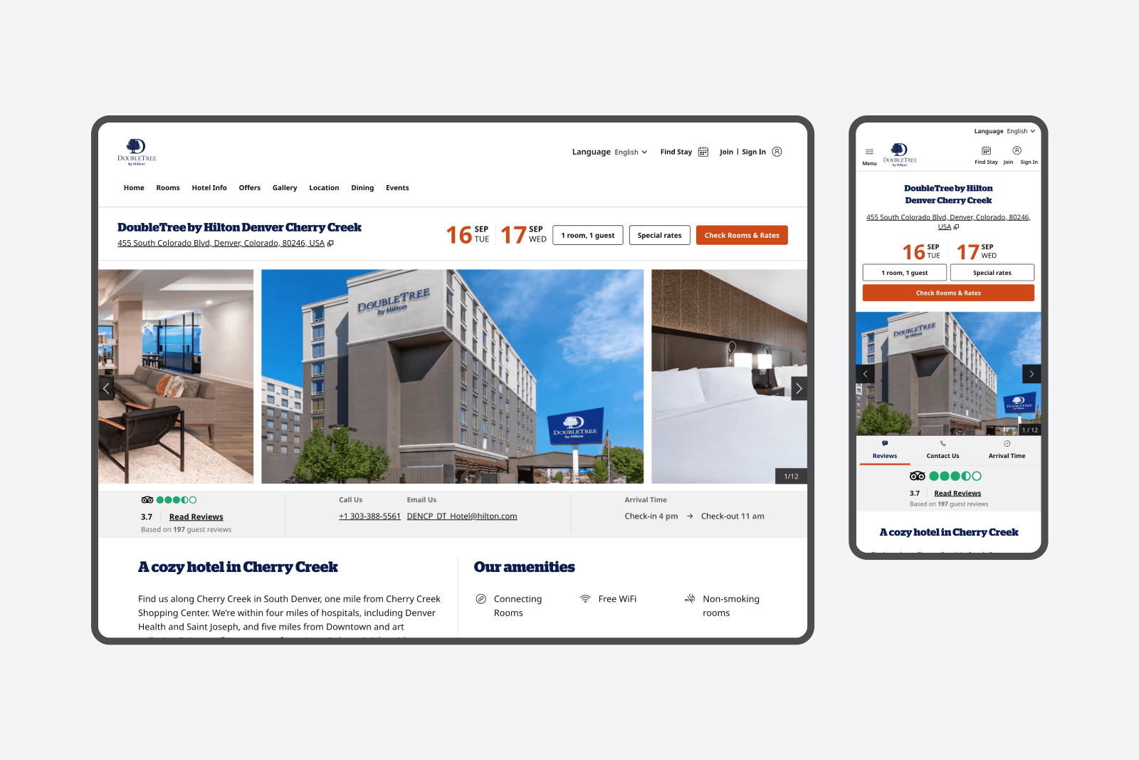
An added complexity was the scale of the project. Hilton had over 7,000 Property pages, each populated from a CMS where hotels entered their own information. This content was automatically pushed into each hotel's property page. Any design improvements had to accommodate variable amounts of content, work across all 12 Hilton portfolio brands, and integrate with existing hotel data.
Business Goal
Hilton’s business goal was to improve the information architecture and brand presence of 7,000+ property pages to increase conversion, engagement, and loyalty sign-ups.
Insights + Foundations
Leveraging my knowledge of Hilton's design system
An initial advantage I brought to the Property page redesign was my deep involvement in Hilton's Figma web design system. I had developed a strong familiarity with Hilton's design language across the site from spending significant time creating, maintaining, and improving the system. I regularly spoke at Hilton's monthly Figma showcases, managed library permissions, and supported teams in adopting the system.
My foundational knowledge of Hilton's design system heavily informed the strategy of the new Property page design.
Views of the Hilton Design system I built and maintained in Figma.
Gaining valuable information with user testing
A UX designer, a content strategist and I reviewed previous user testing results to investigate prior user pain points and opportunities for page improvement. We also requested fresh user screen recordings where users could verbalize their experience on the Hilton Property pages.
Hearing users articulate their thoughts out loud gave us clarity on which page elements were working and which ones were causing frustration. These insights combined with Hilton’s business goals shaped where we concentrated our design and content updates.

User testing showed 75% of participants preferred the carousel film strip hero over the gallery grid hero.
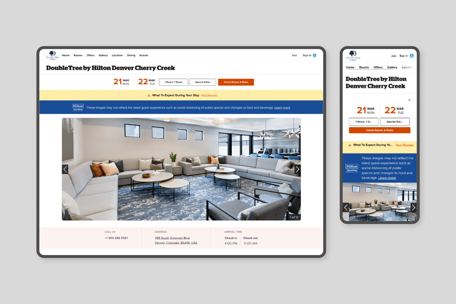
One of the challenges we had with Hilton’s property pages was that they lacked high quality imagery. Pictures of the rooms, particularly in budget brands like DoubleTree and Hampton Inn, were not attractive or high resolution. This meant it was important for product design to carry the experience. We had to surface business value without turning to the easy answer of premium photography. One example where we achieved this was with room tiles:

User click through rate increased 2% after changing the crop of the room image from 2:3 to 3:2, removing the black overlay and bringing the room title below the image.
What I Did
I designed impactful components
We created new components based on business goals and user testing insights. For example, we designed the Locations component to surface information about nearby attractions and airport transportation; items that we heard users ask for in screen recordings. We created the Info Card, a stackable component that showcases bite-sized blocks of heading and paragraph text for easier scannability.
We surfaced essential information in pre-existing components like Hotel phone numbers, emails, room prices and check-in/check-out times.

The Locations component (left) and Info Card component (right)
I unified the Property team into Hilton's core codebase
I knew from my experience on Brand, Booking, Search, and Honors teams that Property pages were missing key branded elements: color, typography, buttons, and iconography. These might seem like minor design details, but they were crucial for signaling to users that they were still within the Hilton experience.
User testing confirmed this. We heard in recorded verbal tests that visitors felt like they had navigated to a different hotel website when entering a Property page.
To address this, I advocated for merging the Property pages into Hilton's monorepo, a major tech debt initiative at the time, so we could use Hilton’s main codebase styles and create a more cohesive, on-brand experience.
When we designed the new components, not only did we have to make sure they were translatable across all 12 brands but also that we were designing with the correct styles from monorepo.


I advocated for accessibility
I collaborated closely with Hilton's accessibility team during these updates to ensure I was up to date with the latest WCAG standards. I advocated for key elements like color contrast, focus indicators and translations adaptability. Accessibility was especially important during this update because the components we built had to be translatable across all Hilton brands.
I collaborated heavily with software engineering to enforce this. For example, in the Groups & Meetings component shown below, I had to evaluate whether each brand's primary or secondary colors in the monorepo were more accessible when paired with white text and then communicated this to the software engineering team for implimentation.
Examples of the Groups & Meetings component we designed for all 12 of Hilton's portfolio brands.
I created custom iconography
A teammate and I created a library of over 100 proprietary icons for Hilton. We used a keyline grid and a comprehensive icon creation guide to keep the library consistent. The icons were published company-wide using the Hilton shared codebase. They were adopted across the entire Hilton website, the Hilton app, Marketing, Legal, and Hotel signage.
Results
This redesign directly drove higher engagement and reservations in Hilton property pages. In addition, it addressed significant tech debt by pushing the team's transition into Hilton's main codebase. This made the product far more sustainable. Updates became quicker to implement, design system changes could be adopted seamlessly, and site improvements no longer required band-aid fixes over an old system.
Other Hilton Work
Personal Information
Two other designers and I were tasked to give users a more focused view of their personal information. I brought new iconography, accessibility considerations, clear typographic hierarchy and an improved user experience.
Navigation
A UX designer and I modernized Hilton's site navigation across desktop, tablet and mobile. I brought accessible focus indicators, optical alignment, typography changes and improved the information architecture.