Simplified scheduling for stressed parents
with a responsive family calendar
My role
- Competitive and user research
- Created a foundational style guide
- Mapped user flows
Team
Product Design (me)
Founding Product Leader • Founding Content Leader
Result
first year on Google Play

The Problem
“Nearly half of American parents—48%—report feeling completely and overwhelmingly stressed on most days...”pyschologytoday.com
Former colleagues Jessica Etting and Amanda Roessler approached me with the idea for Jam, a family calendar app designed to ease the mental load of burnt-out parents. The concept was to bring together all the logistics of running a household into one shared, accessible app for the entire family.
My role was to design the app at high fidelity for a future developer, define complex responsive user flows and explore the brand’s overall look and feel.

A page of Jam's pitch deck illustrating the problem of the mental load on parents.
Business Goal
Jam's business goal was to take logistics of running a household and merge them into one singular app designed for and accessible by the entire family.
Planning + Research
Jam began as a few rough wireframes and documentation
Starting with rough wireframes and a few pages of documentation, I conducted competitive research to understand the existing market. I looked at shared calendar setups from Apple and Google, along with task management tools like Trello and Google Tasks.
Throughout the design process, I referenced familiar patterns and interactions from these products. I wanted to shape a product experience that felt intuitive to users, yet was still differentiated for Jam's audience.


Early Balsalmiq wireframes sketching out the Jam dashboard.
Exploring look and feel
My next step was exploring the brand's visual identity: colors, shapes, font and grid. I selected elements with our target audience in mind to ensure the app’s design would resonate with them. The founders and I concluded that muted color tones with neutral backgrounds would be a strong direction. The target audience:
- Women, age 27 - 45 with children
- Live in zip codes with the top 25% income
- Interests include parenting, family, mom groups, organization, work life balance.
- Enjoy brands like Goop, Magnolia Home, Home Edit, Hello Sunshine

Exploring color and font from our target audiences' most loved brands.
What I did
I designed a dashboard for the whole family
The dashboard was the centerpiece of Jam. Unlike traditional finance/sales dashboards, this needed to be accessible and engaging for children and adults.
To achieve this, I focused on creating a clear, highly visual layout. I utilized color and structure over stats or progress charts. At the top, a weekly view provided an at-a-glance overview. Below, users could dive into a detailed daily calendar, to-do list, and shopping list.

Early concept for the Jam dashboard.
Mobile prototype showing the dashboard flow and interactions.
I mapped complex user flows
Users could create tasks, events, and lists in Jam. Each of these items were assignable, schedule-able and could be linked to one another. It was my task to build these flows in low and high fidelity.
Mapping user flows served several purposes. They helped us identify which features were truly necessary, how they would integrate with each other, and where more thinking was needed. This was crucial during Jam's creation phase because we could explore ideas quickly and cheaply.

Example of one of the many user flows in Jam. This one focused on adding an event.
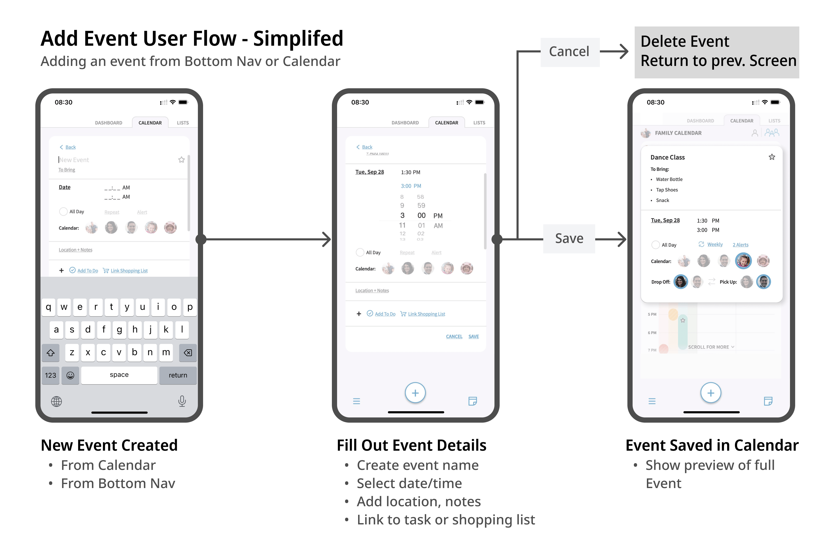
An additional simplified view of the add event user flow.

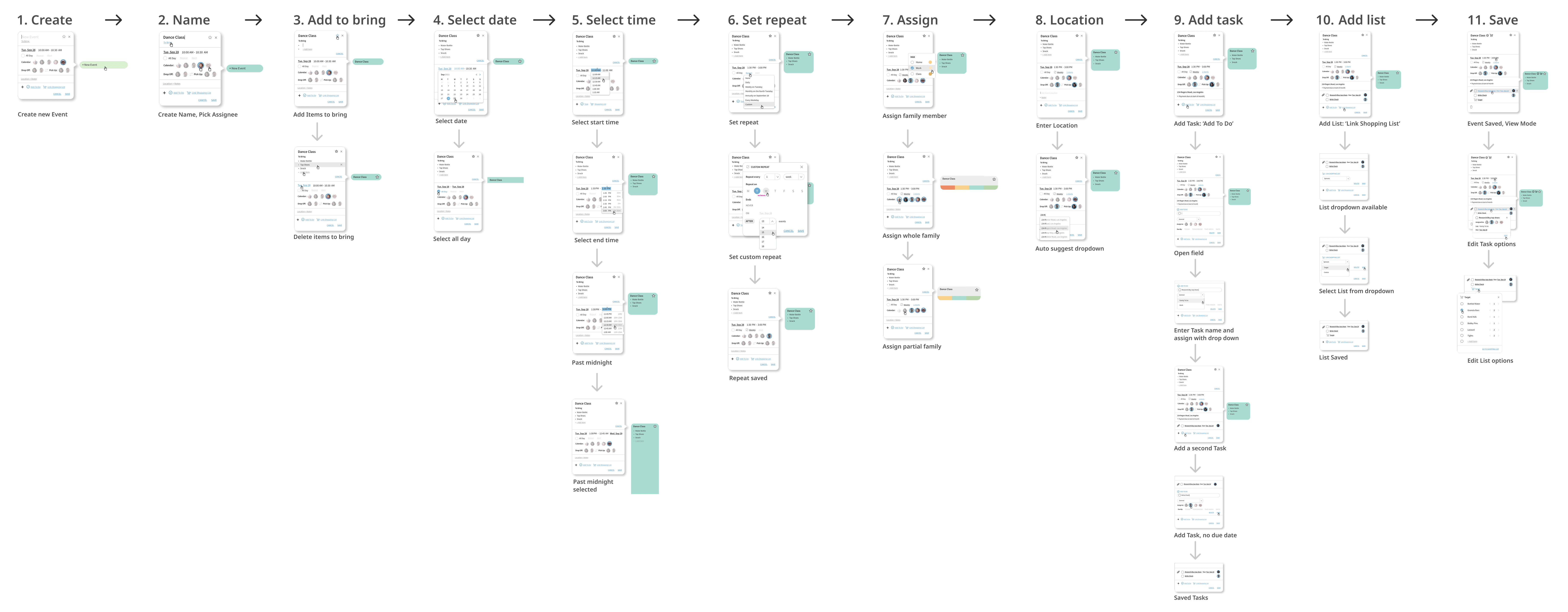
High-fidelity user flow exploring the full features of adding an event: time/date, assigning, to bring, repeat, drop-off/pick-up and linking tasks and lists.
I created a comprehensive style guide
I created a comprehensive style guide to support a smooth handoff to development. The guide covered spacing, typography, responsive behavior, color, and user flows.
Since I wouldn't be present to oversee development, my mockups and documentation were designed to be exceptionally clear so a future developer could easily implement my work.
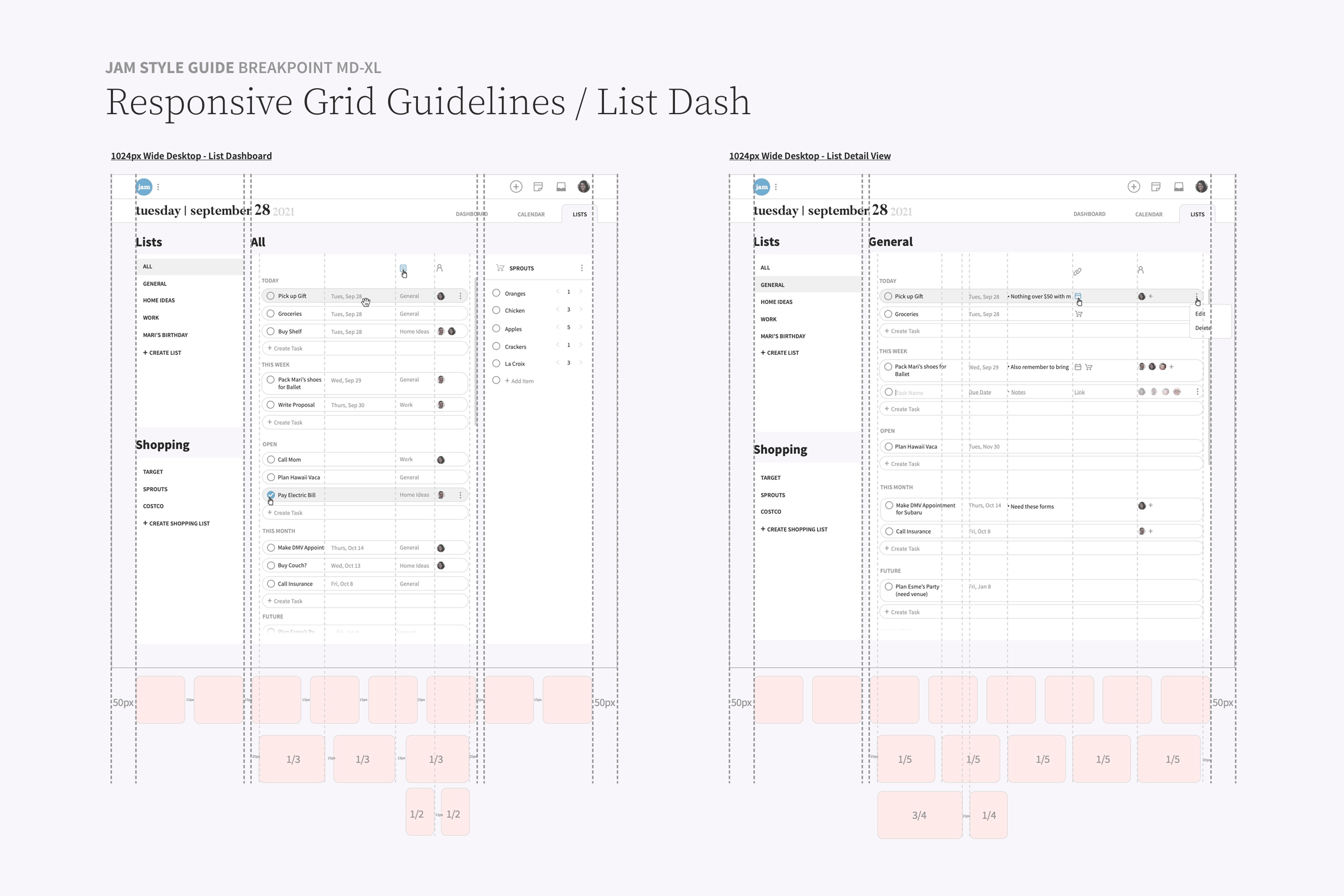
A page from the Jam style guide showing responsive margin framework.
Results
The Jam Family Calendar app was launched in February 2024 and has since been downloaded over 5,000 times on Google Play.
I'm proud of the foundation I created through my design system, user flows and comprehensive style guide for Jam Family Calendar. This project taught me valuable lessons about when (or when not) to design in high fidelity, knowing your user and building a sustainable product that can be iterated in future redesigns. Most of all, it was rewarding to contribute to a product tackling a very real challenge for modern families. I'm excited to see Jam continue to grow and ease the mental load for parents.
first year on Google Play