Increased AI feature adoption by 63%
for a B2B SaaS startup
My Role
- Audited agentic AI UX
- Defined core creation flows
- Prototyped live AI workspace
Team
Product Design (me)
Founding Product Leader
Founding Software Engineer Leader
Result
The Problem
Low AI engagement was limiting user activation and conversion on Leads.new.
Leads.new helps marketers create AI-powered lead magnets. When I joined, only 38% of users were interacting with the AI chat agent in the workspace. As a result, many users never experienced the product's full value which reduced the likelihood of publishing or converting to a paid plan.
I partnered with the founders to redesign the workspace, focusing on increasing AI chat engagement. The goal was to leverage the value of the AI chat agent to build a workspace flow that felt effortless from start to finish.
Exploration
Auditing the current AI experience
I recorded a Loom video with my first impressions of the Leads.new AI workspace, which helped me identify some immediate issues:
- The AI was hard to find when first landing in the workspace
- The design of the AI inputs, outputs and controls didn’t feel cohesive with Leads.new branding
- How to directly edit the lead magnet's text or imagery was unclear
This audit helped me focus on the highest-impact issues and gave me a clear direction for improving AI engagement in the workspace. It also gave me unbiased insight that I referenced throughout the project.
Defining the problem and success metrics
Before exploring solutions, I mapped out two potential problem spaces:
1. The user's experience of the AI itself: This focused on the performance of the AI such as output quality, hallucinations, and response times.
2. The user's experience with the AI as part of the creation flow: This focused on how our target users (marketers) interacted with the AI as part of the overall workflow, including research insights, UI design, and information architecture.
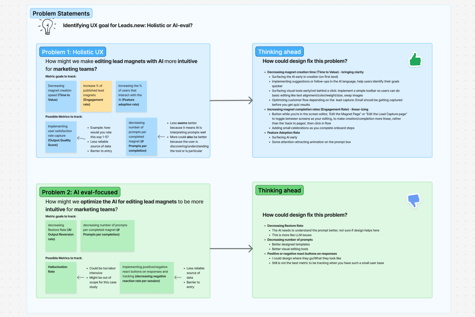
My Figjam workshop outlining both problem spaces.
The founder and I agreed that the second choice aligned best with what was currently needed by Leads.new. After workshopping ideas, we landed on the project’s goal:
How might we make creating a lead magnet with AI feel effortless?
Success would be measured by:
- Increasing percent of users who interact with the AI (Feature adoption rate)
- Increasing percent of published magnets (Engagement rate)
- Reducing time from magnet creation to publish (Time to Value)
Business Goal
How might we make creating a lead magnet
with AI feel effortless?
Research
I analyzed other AI creation tools
Tools like Lovable, Magic Patterns, Replit, and v0 gave me insight into current AI agent best practices. I focused on layout, editing, chat real estate, and how each tool guided users forward.
My takeaways were:
- None offered a clear step-by-step creation flow
- Most gave significant real estate to the AI agent and prompt area
- Direct editing and prompting were clearly separated
- Many AI agent tools were built for developers or technical designers, not marketers (our target users)
There was a clear opportunity to borrow patterns from these tools in a way that still felt like Leads.new, while speaking more directly to marketers.
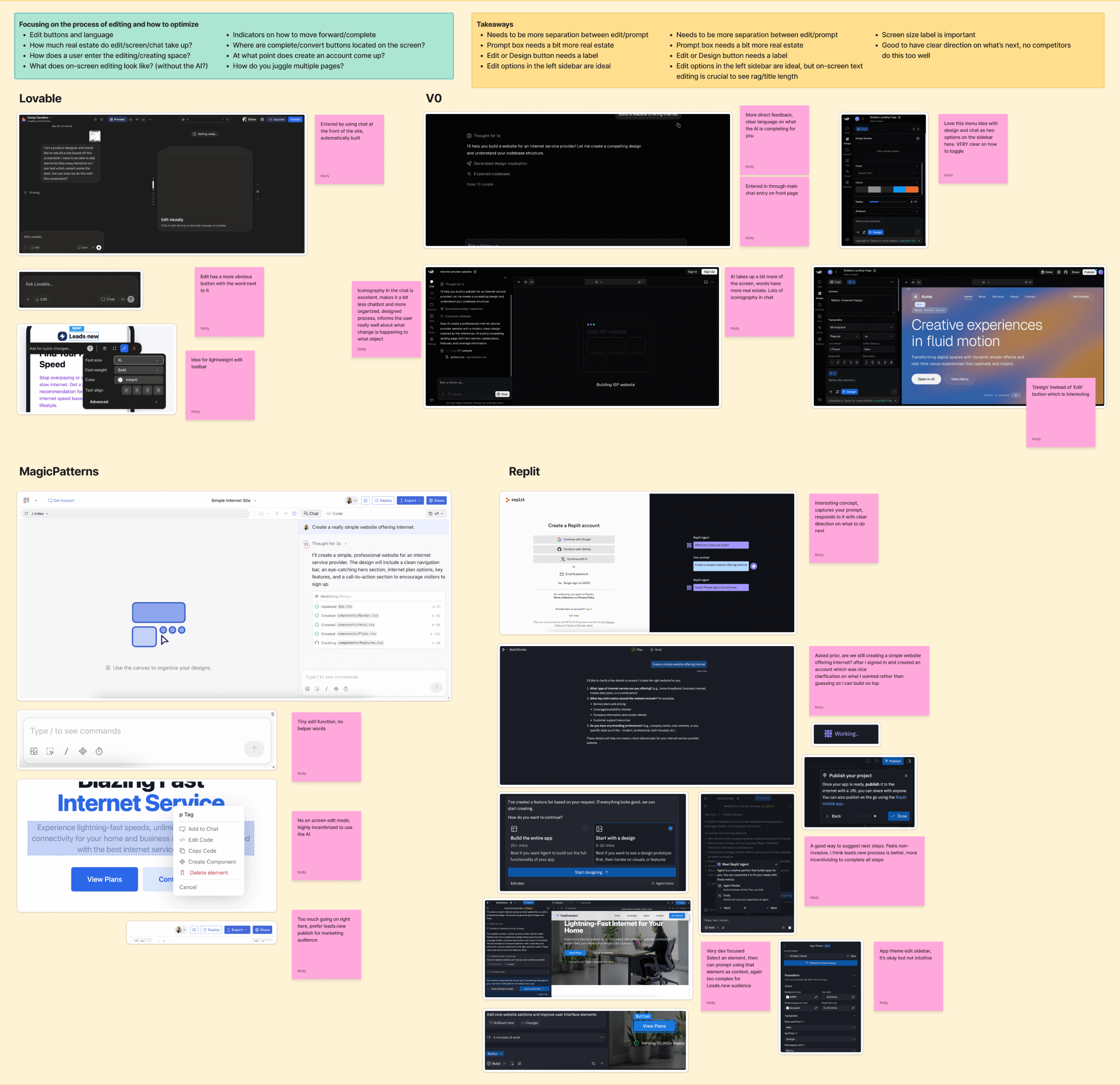
Conducting competitive research for Leads.new presented me with current AI agent best practices and opportunities to improve them.
I mapped the current user journey
Creating the user journey helped me understand where users were losing momentum during magnet creation. A few opportunities became immediately clear to me:
- The AI needed to be surfaced earlier in the flow to increase feature adoption rate
- We needed to improve the initial edit loop currently present in the flow
- There was no obvious next steps for the user after the magnet was published
Mapping the current journey highlighted these issues but also presented solutions where I needed to focus my energy.
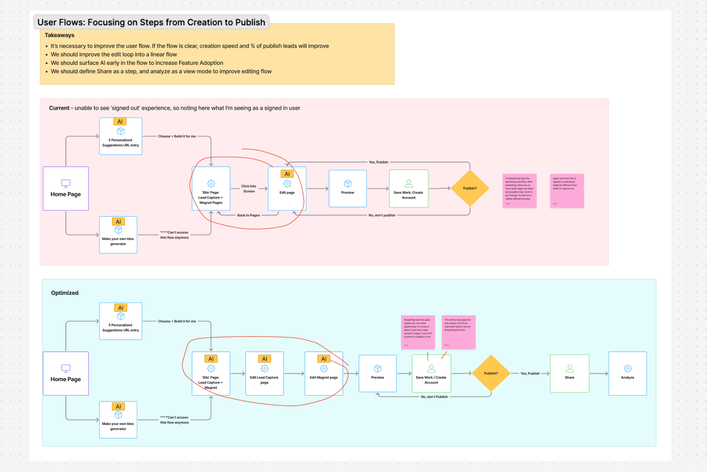
The current and optimized user flows I created for Leads.new.
Prototyping with AI
I brought my design into Cursor with Figma MCP
After aligning with the founder, we decided that building a “blue-sky” workspace would be more valuable than iterating on the existing experience. This approach gave us room to rethink the workspace without being constrained by previous decisions. I created an initial draft of the Leads.new landing page in Figma complete with auto layout and and key design elements to build from.
Once the design was 60% there, I turned it into a working prototype using Figma MCP and Cursor. Making the switch from design to code early allowed me to start testing interactions and solving problems before it went into development.
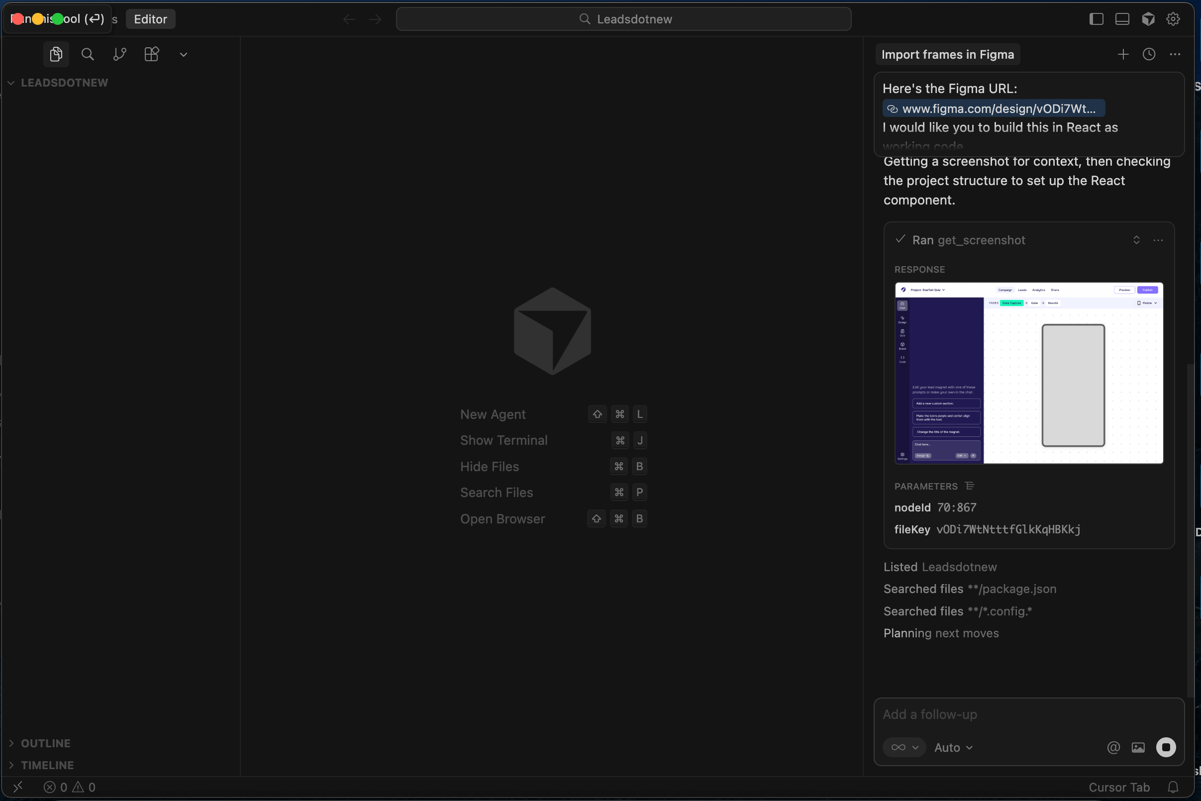
Building live code from my mockup with Figma MCP.
I used Cursor to refine and enhance the prototype. This included a lightweight AI simulation that let me design input, prompt, and response patterns without building out real AI backend. I also added hover states, animations, and subtle interaction details to make the workspace more intuitive and engaging.
Product Solutions
I translated insights into solutions
Using insights from my UX audit, user flow pain points, competitive research on AI agents, and prototype feedback, I made informed decisions about how to improve the Leads.new workspace.
Insight
AI didn't feel central to the workspace experience
Solution
Surface and highlight the AI chat immediately on first land
If we wanted to increase AI feature adoption, the AI couldn't feel hidden or optional. It needed to be clearly positioned as the starting point of the workspace flow. It needed to be easy to find, easy to understand, and inviting to interact with.
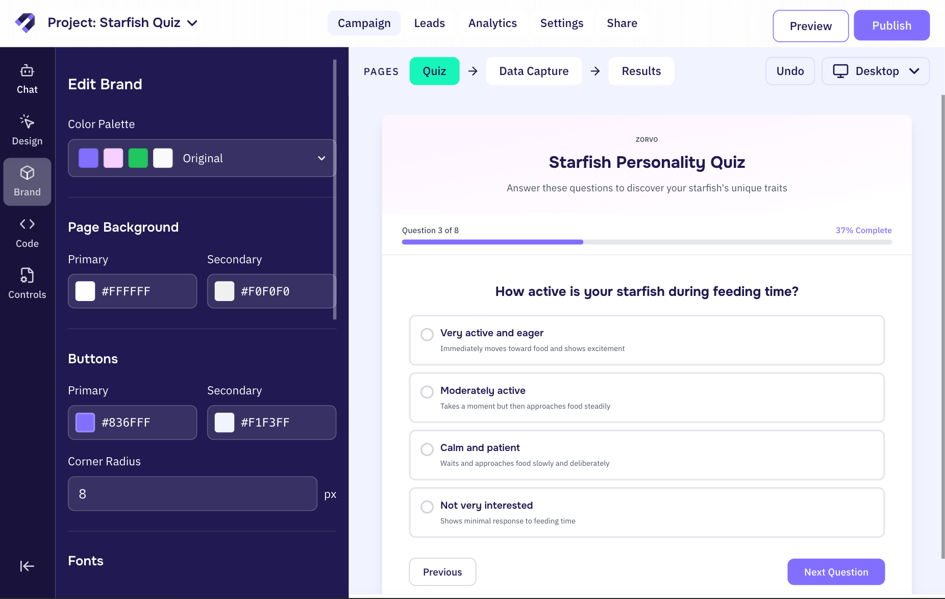
I redesigned the first landing page of the workspace to make the AI the most prominent element on the page. This ensured users immediately understood where to begin and reinforced the AI as the primary driver of value.
To support this, I introduced several supporting design decisions:
- Gave the AI more screen real estate to signal importance
- Created a more intuitive restore flow for prompts
- Added subtle animation and higher contrast to draw attention without feeling disruptive
- Introduced prompt suggestions to direct users to an easy next step
- Improved UX writing to set clear expectations
- Redesigned prompt box buttons to feel more cohesive with Leads.new
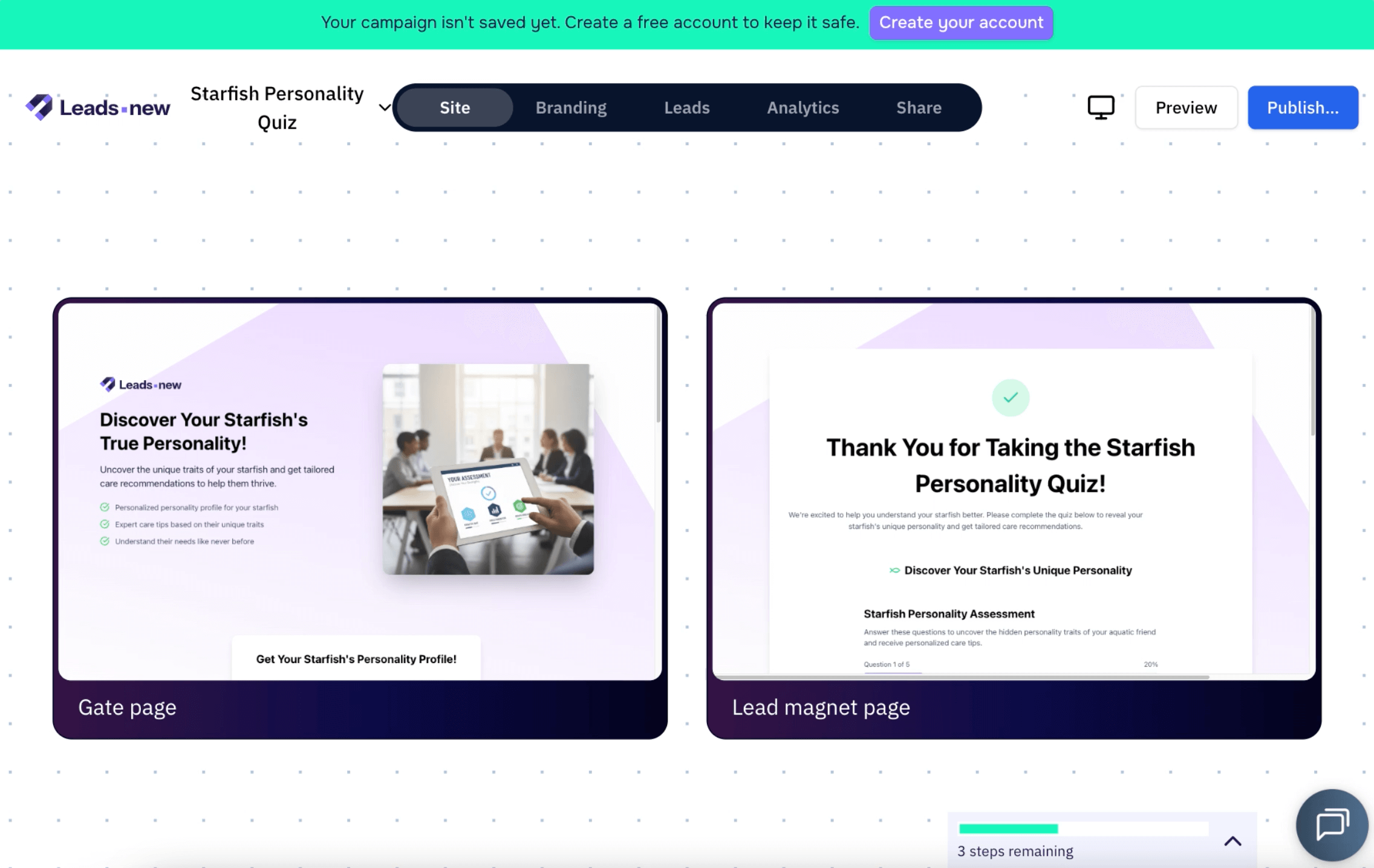
The original and redesigned first landing page of the AI workspace.
Insight
The Design tool was hidden in the prompt box as an unlabled icon button
Solution
Clearly separate Chat and Design modes to improve speed and clarity
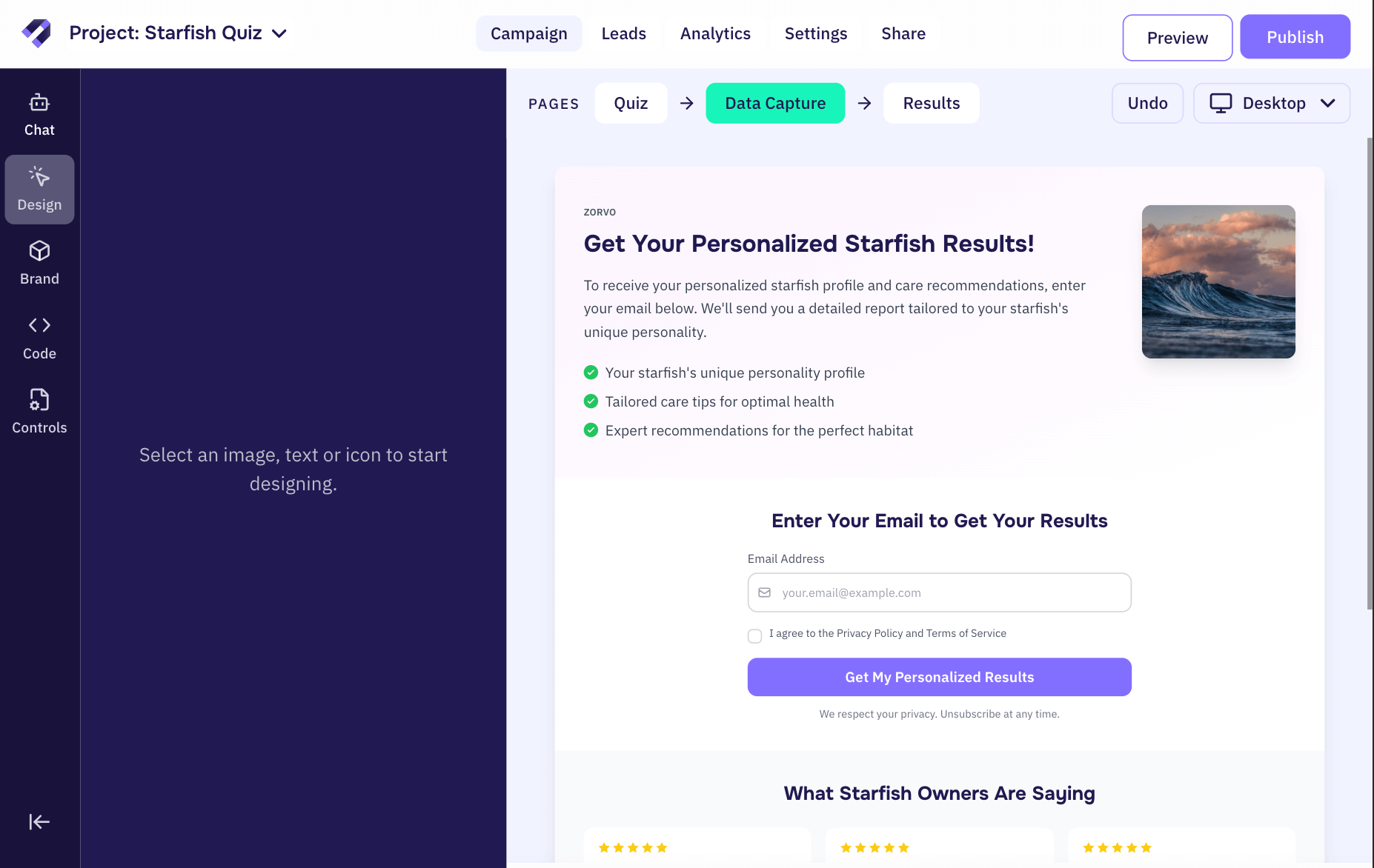
A major friction point during my UX audit was not immediately understanding how to directly edit text, icons and images within the lead magnet. The edit/design action was represented by a single icon button which allowed the user to direct select items on the preview. This is a common pattern in other AI agents, but wasn’t intuitive in this context.
I proposed a clearer distinction between AI chat and direct editing to reduce confusion and increase creation speed. When a user selects text, icons, or images in the lead magnet preview, the interface shifts into a focused Design mode which triggers a panel takeover. This temporarily hides the AI chat, allowing the user to concentrate on the task at hand. The Design panel stays context aware, showing only the tools relevant to the selected element.
By making direct editing automatic on click and easy to discover, the workspace reduces cognitive load, increases creation speed, and improves the likelihood that users publish a lead magnet.
The new workflow of the Design tool, seperated as its own mode in the left hand panel.
Insight
Tools and steps were not organized or grouped together
Solution
Group tools and steps in seperate menus for easier access and quicker discovery
To increase creation speed and publish rate, the workspace needed to be easier to understand at a glance. Editing tools like Design, Brand, and Code were scattered across the interface, adding decision friction and slowing users down.
I reorganized the workspace into two clear groups: Tools and Steps.
Tools allow users to directly edit the lead magnet and remain available at all times. I grouped the existing tools, Chat, Design, Brand, and Code, into a fixed left-hand panel so users could easily switch between them while editing.
Steps guide users through the creation process, from building to publishing and sharing. I placed these in the top navigation to make next steps clear and intuitive.
By grouping similar elements, the workspace became easier to learn and faster to use.
Steps and Tools grouped as seperate menus in the workspace.
Designing an AI tool panel
Along with organizing tools and steps, I designed focused panel views for each tool. I introduced new options where they added value, and removed others that didn’t support the core creation flow.
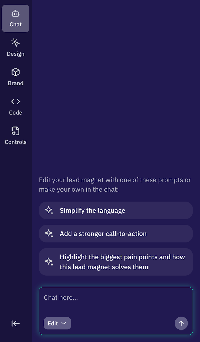
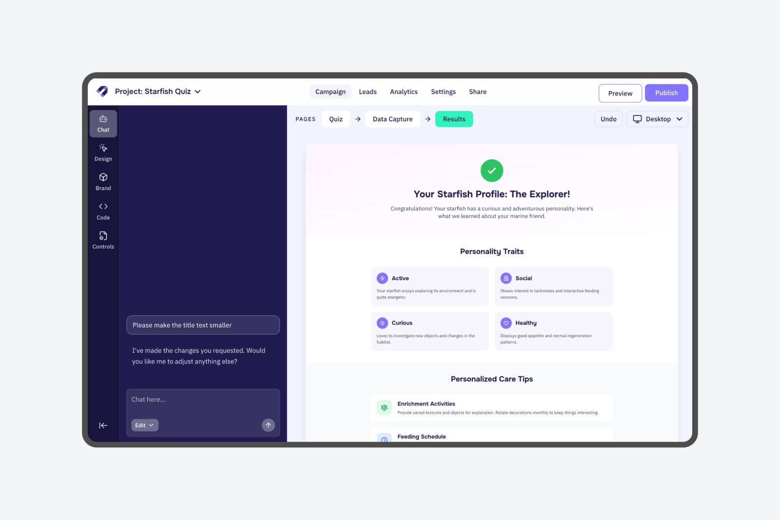
Chat The core tool in the Leads.new workspace, with a prompt input field, response window, and send button. Users could switch between Edit and Plan modes, revert to previous prompts, and use chat suggestions to explore and what's possible in the workspace.
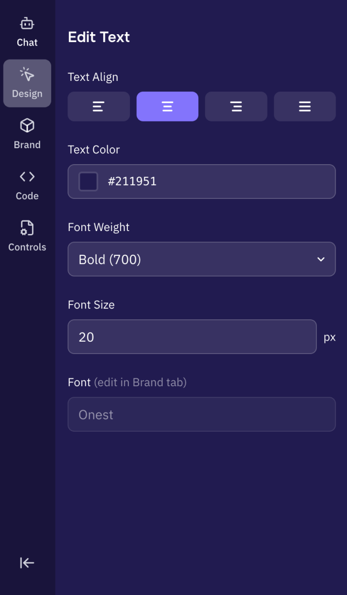
Design This tool let users select text, icons, or images in Design mode, then edit or swap those elements using the left panel. The options in the panel updated based on what was selected. Previously, this capability lived as a small button in the chat input. I proposed elevating it to a full mode accessible from the vertical menu so it felt more discoverable and intentional.
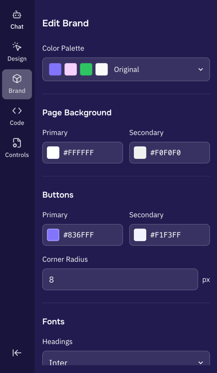
Brand Brand gave users the ability to make broader changes across the magnet, such as colors, typography, and button styles. In the original version, these options lived on a dedicated page accessed through the top navigation. In my redesign, Brand became a tool within the left panel. Because of the reduced space, I simplified the toolset to prioritize what marketers would use most.
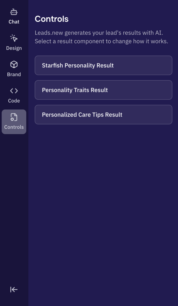
Controls Because the lead magnet itself used AI, two users could have the same inputs and receive different outcomes. Controls was built to give more control over these AI-generated results. The user could select a component in lead magnet preview, then use AI to edit the logic behind magnet’s output.
Sidequest
Designing Controls to manage LLM variability
As we tested the lead magnets created by our AI agent, we noticed that AI-generated results varied significantly. This did give a 'magic' effect to the lead magnet, but made it harder for marketers to predict, trust, and refine the outcomes. To address this we designed Controls, a powerful, user-friendly tool that gave marketers more influence over how results were generated.
Controls became the most complex out of all Leads.new's tools. It allowed users to adjust the logic powering the results page through chat inputs. As I explored it further, more questions surfaced about its purpose, how it should function, and how to present it in a way that felt clear and valuable to users. Key questions I began exploring:
- Why rely on LLM variability for lead magnet results instead of generating a fixed set of outputs like a traditional quiz?
- Would Controls only manage the Results page, or could it change other parts of the magnet?
- Was giving users access to this tool actually valuable, or would it create unnecessary complexity?
After realigning with the founders of Leads.new, it became clear that AI generated results were a core value they wanted users to benefit from, not something to hide behind the scenes. This shifted my focus toward designing Controls in a way that explained the feature simply, made its value obvious, and kept the experience from feeling overwhelming.
Seeing the Controls experience live in the prototype made it clear that giving users direct edit access would introduce too many failure points in results generation. I recommended shaping the prompt with AI instead of allowing a user direct edit.
Building the Controls functionality would allow for better control of LLM outputs. Other opportunities to better manage LLM output included using a secondary agent to perform quality control on the primary model's responses (LLM orchestration). AI agents like v0, Replit already use this multi-agent system. We thought about how this might be an emerging best practice for AI agents, especially based on the varied results we were seeing from the current Leads.new model.
Validation
I ran a no-budget round of user testing
I showed the prototype to a test group and recorded their responses. 75% of users preferred the new design I proposed over the current Leads.new experience.
Results
I presented my final solutions to the founders as a live prototype. The core solutions focused on:
- AI-centered workspace: Supports seamless collaboration between user and agent with higher contrast, more screen real estate and branded design elements
- Separated Chat and Design tools: Reduces confusion and cognitive load by implimenting a fixed left hand panel with distinct design and chat mode
- LLM Variability Control: Gives users a tool to control the variability of AI-generated results, allowing them to further customize and refine the lead magnet outputs
The new proposed workspace experience for Leads.new, focusing on AI collaboration and engagement.
Takeaways:
- Working on agentic AI UX was really exciting. The space was mature enough to provide me with strong reference points for the project, but still young enough to feel cutting edge when exploring new interaction patterns and ideas.
- Live prototyping is a clear winner for communicating product solutions. Building an interactive prototype gave the team a much clearer understanding of my solutions, particularly when showing hover states and more complex tool interaction flows.
- Time constraints = tradeoffs. I found that 80% perfect visuals with a working prototype was enough to clearly communicate my core idea. This directed my energy from pushing pixels to asking myself Is this actually solving the problem?
The redesigned AI workspace was implemented in early December 2025. Comparing metrics from the month before and after launch showed that we met our core business goal. More users interacted with the AI chat in the creation flow, which led to higher completion and publish rates for lead magnets, overall indicating a more effortless experience. Beyond the metrics, the project surfaced important questions about designing agentic creation experiences, balancing user control with automation and managing LLM variability.