Helped drive 9% revenue growth
with an in store self checkout program
My Role
- Designed new self checkout UI
- Implemented loyalty personalization
- Coordinated dev handoff
Team
UI Design (me) • Illustrator • UI Lead
Result
The Problem
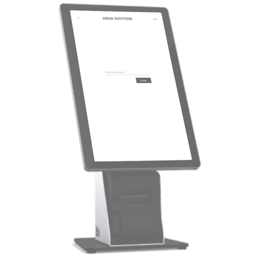
The default software for Urban Outfitters' upcoming self-checkout system had a poor user experience and confusing information architecture that didn’t align with the brand.
In 2018, Urban Outfitters planned to initiate a pilot self-checkout program at its flagship store in Herald Square, New York City. The aim was to stay competitive with other retailers testing self checkout and cater to their younger tech-savvy audience with new touchscreen kiosks.
The point of sale 'Elo' kiosks came with a default software that had a poor user experience and confusing information architecture that did not reflect the Urban Outfitters brand.
A lead UI designer and I were brought onto the project to improve the visual design, brand presence, UO Rewards options and overall user experience in self checkout.
How might we
How might we redesign the default self-checkout software to be more intuitive, align with the Urban Outfitters brand, and enhance the in-store customer experience?
What I did
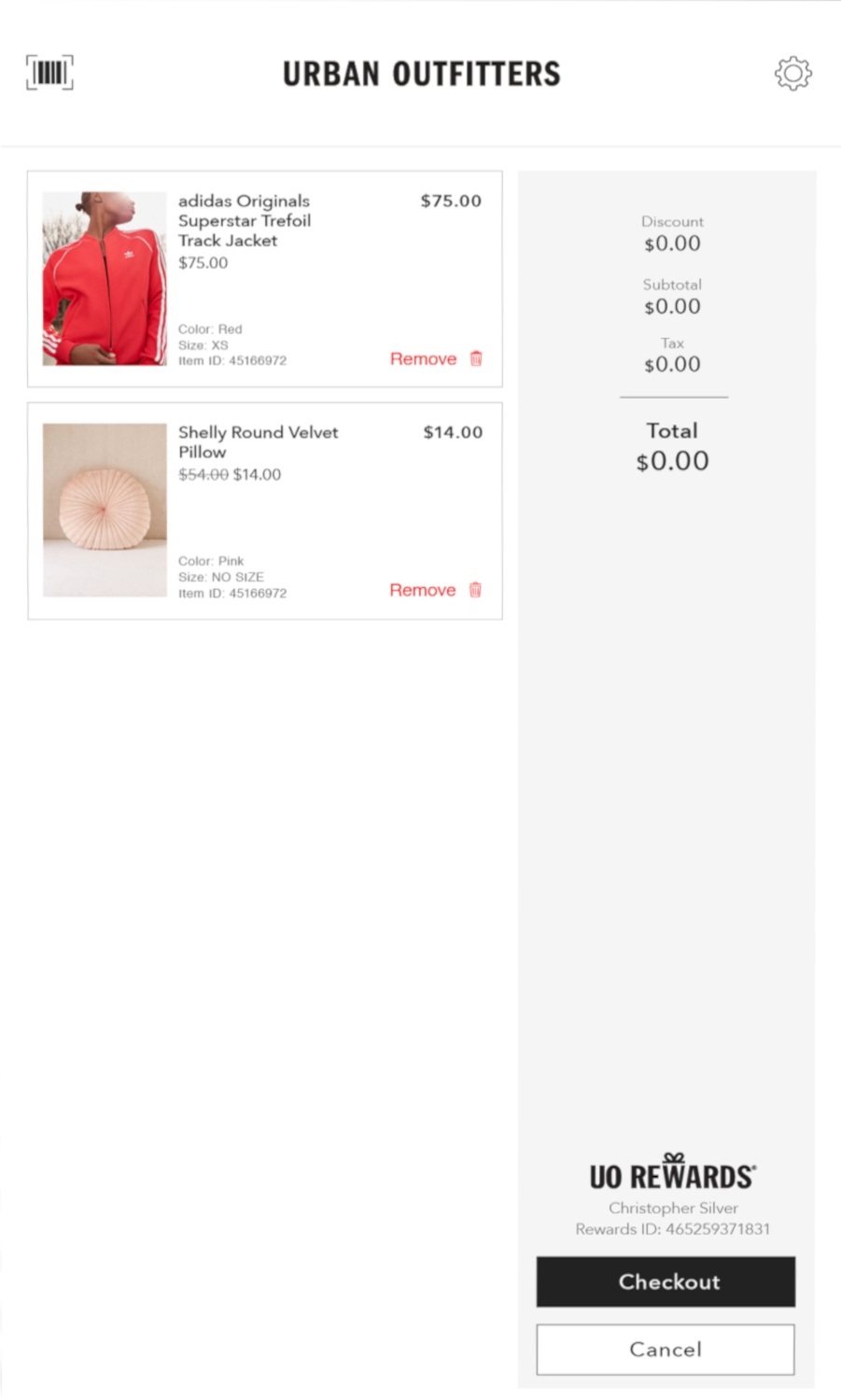
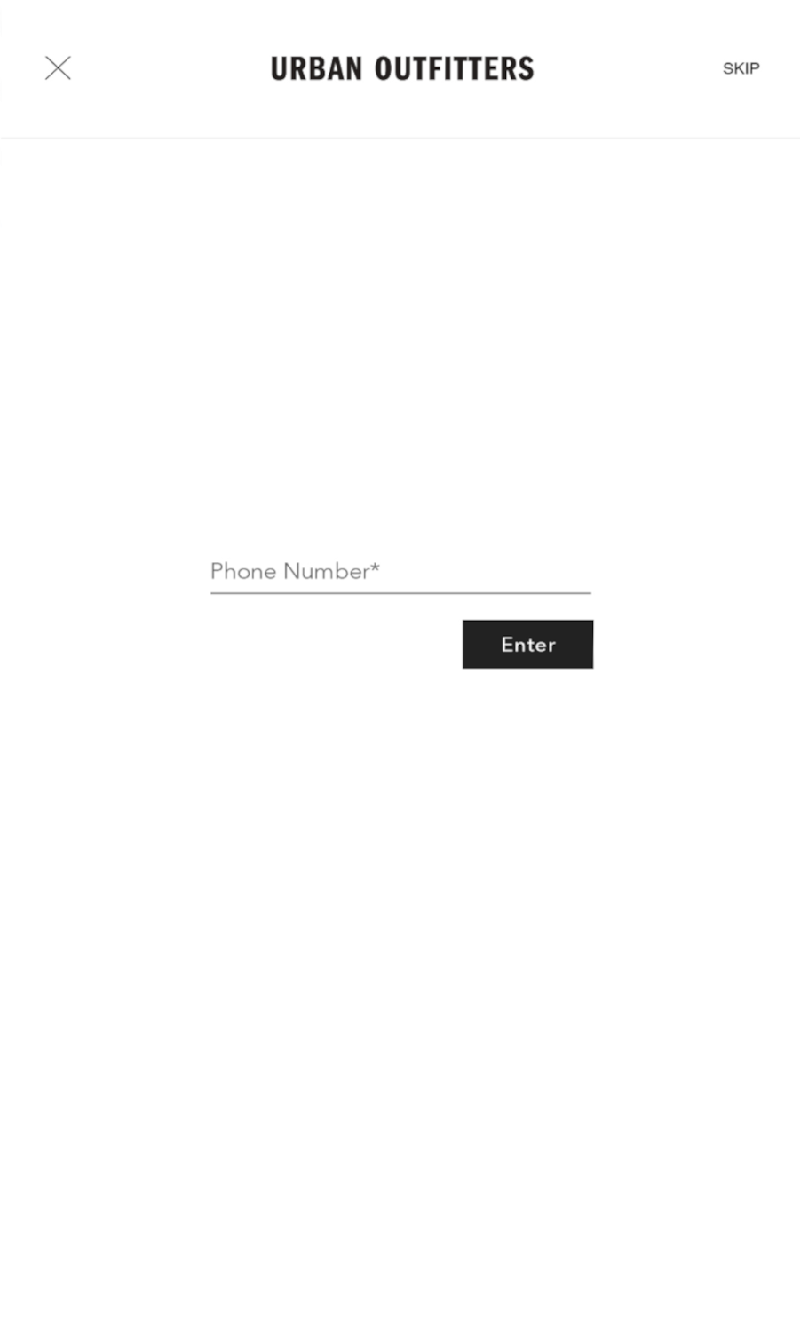
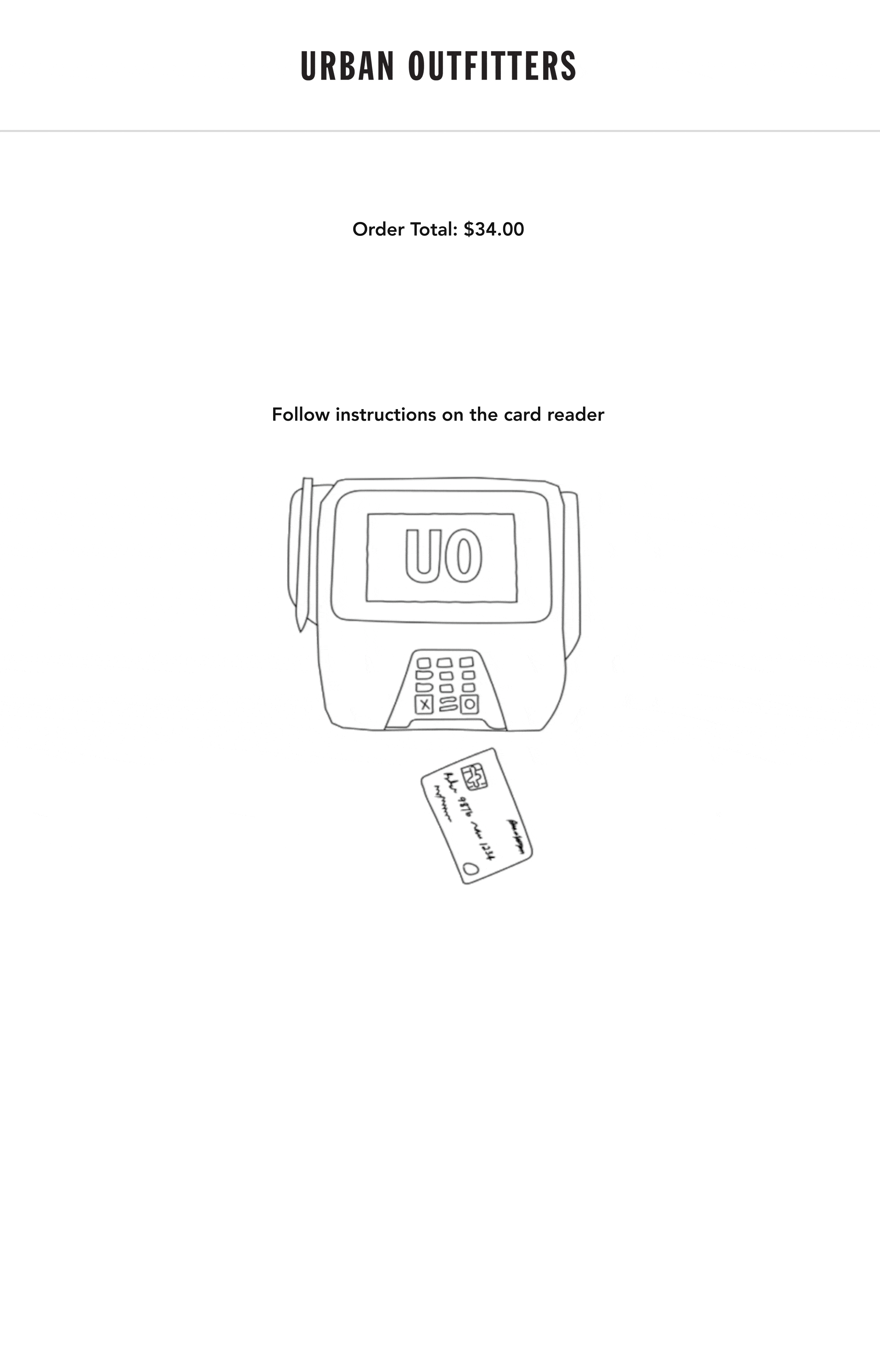
I designed the self checkout interface
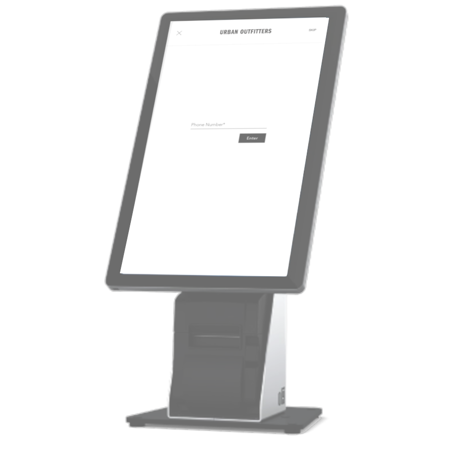
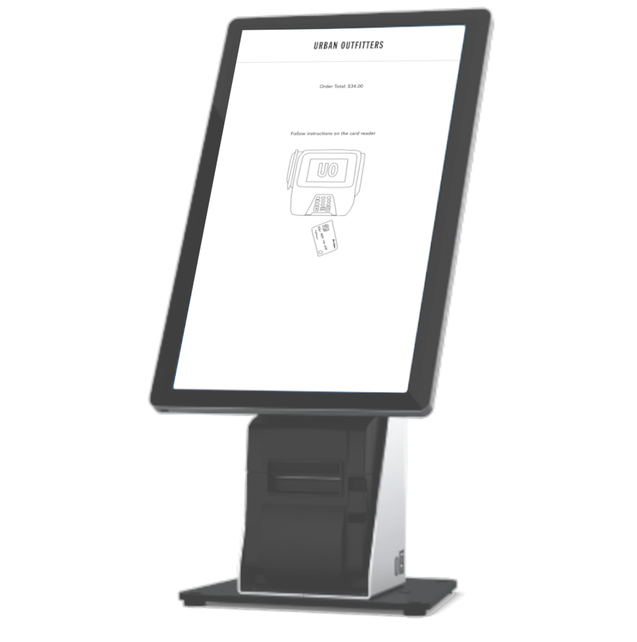
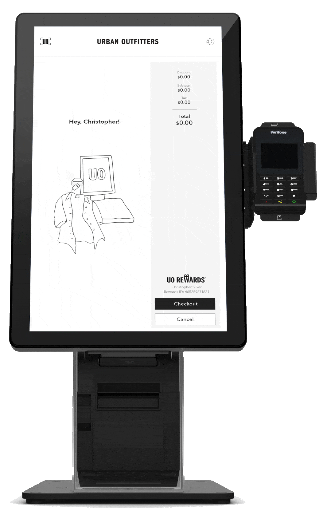
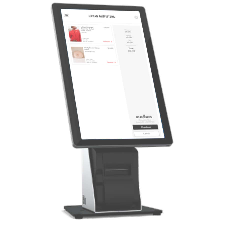
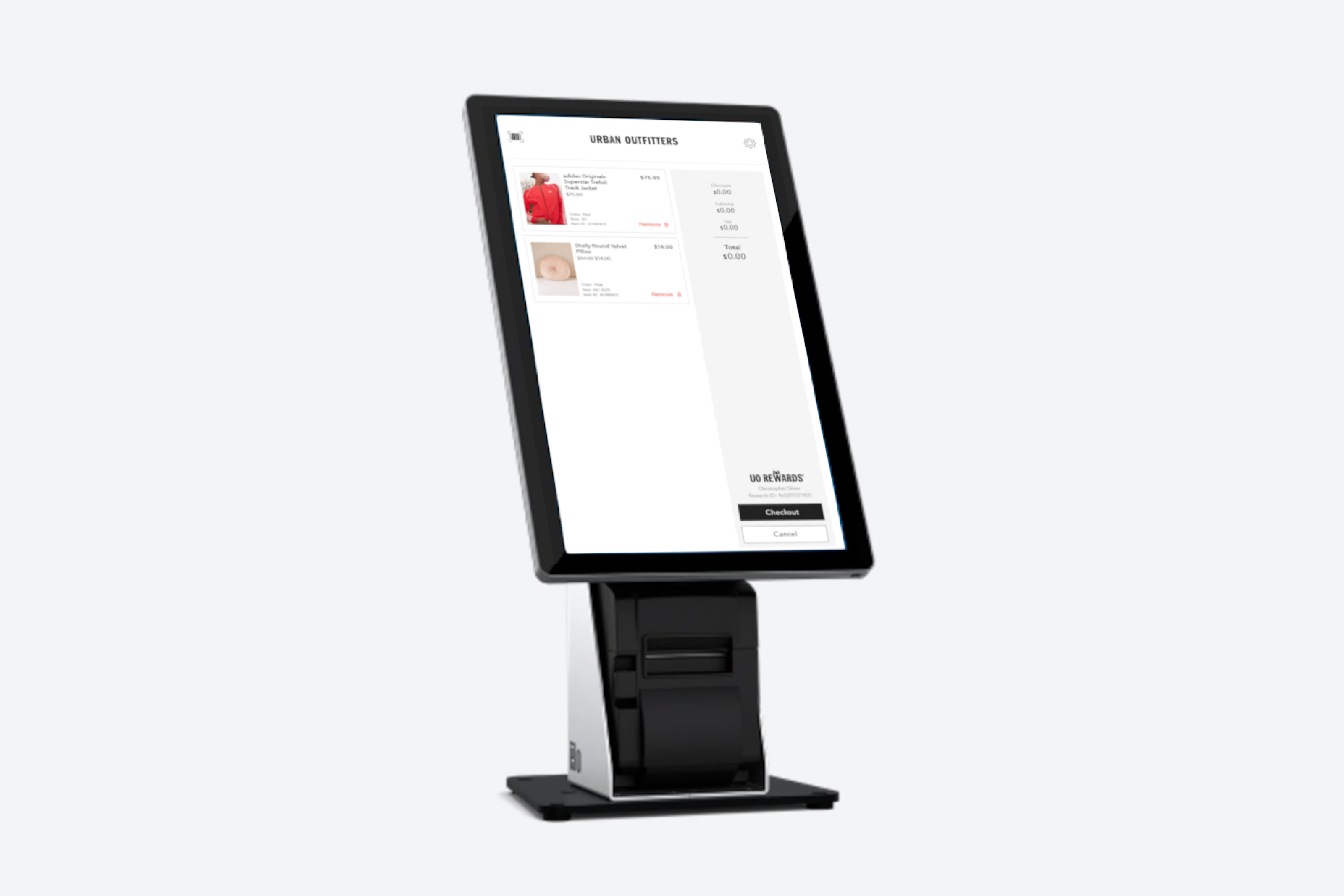
I used the default self-checkout software flow as a framework to define screen states: active, signed-in, checkout, paying, and finish. From these states, I designed screens that incorporated Urban Outfitters’ branding, typography, and visual style.
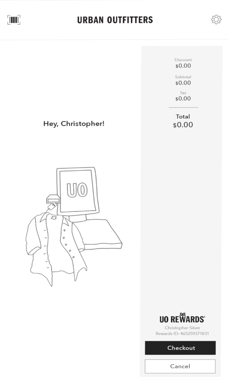
Users could quickly access their rewards account by scanning a code on their mobile device.
I identified opportunities for personalization such as greeting users by name in the checkout state when they signed in to their rewards account.
I collaborated with illustrator and designer Miranda Leung to create Urban Outfitters–style empty state animations. This kept users engaged during more passive moments of the checkout process.
I coordinated design handoff
For development handoff, I created detailed redlines that mapped out styles using Tailwind CSS nomenclature.
After handoff, I collaborated closely with software engineering to fine-tune details such as animations and spacing. The touchscreen kiosks with the new UI were installed in Herald Square in August 2018.
Final UI of self checkout
In the Field


Customers interacting with the new self checkout kiosks in Herald Square, New York City.
“The Urban Outfitters customer is clearly voting for self checkouts with the percentage of self checkout transactions highly exceeding expectations...”
“...Not only is this a convenient way for our customers to transact, but it also allows us to reposition labor to further service customers and drive conversion on the selling floor. Given its success, we are currently working on plans to rollout self checkout to additional Urban Outfitters stores.’”
Urban Outfitters Group CEO Trish Donnelly
www.barrons.com
A Tiktok video from 2023 with the UI I designed in 2018.
Results
A month after the kiosks were rolled out with the newly designed interface, the results came back that self checkout had been highly favored by the UO Customer.
Forbes published an article stating Urban Outfitters had been among the top performing companies in the retail sector that year, with self checkout being one of the reasons for its 9% revenue growth and 50%+ earnings growth.
Other Urban Outfitters Work
Help & Info Section Redesign
I redesigned the typography and information architecture for 20 Help + Info pages, breaking up dense text with iconography, photography, and clear type hierarchy.
UO Blog Overhaul
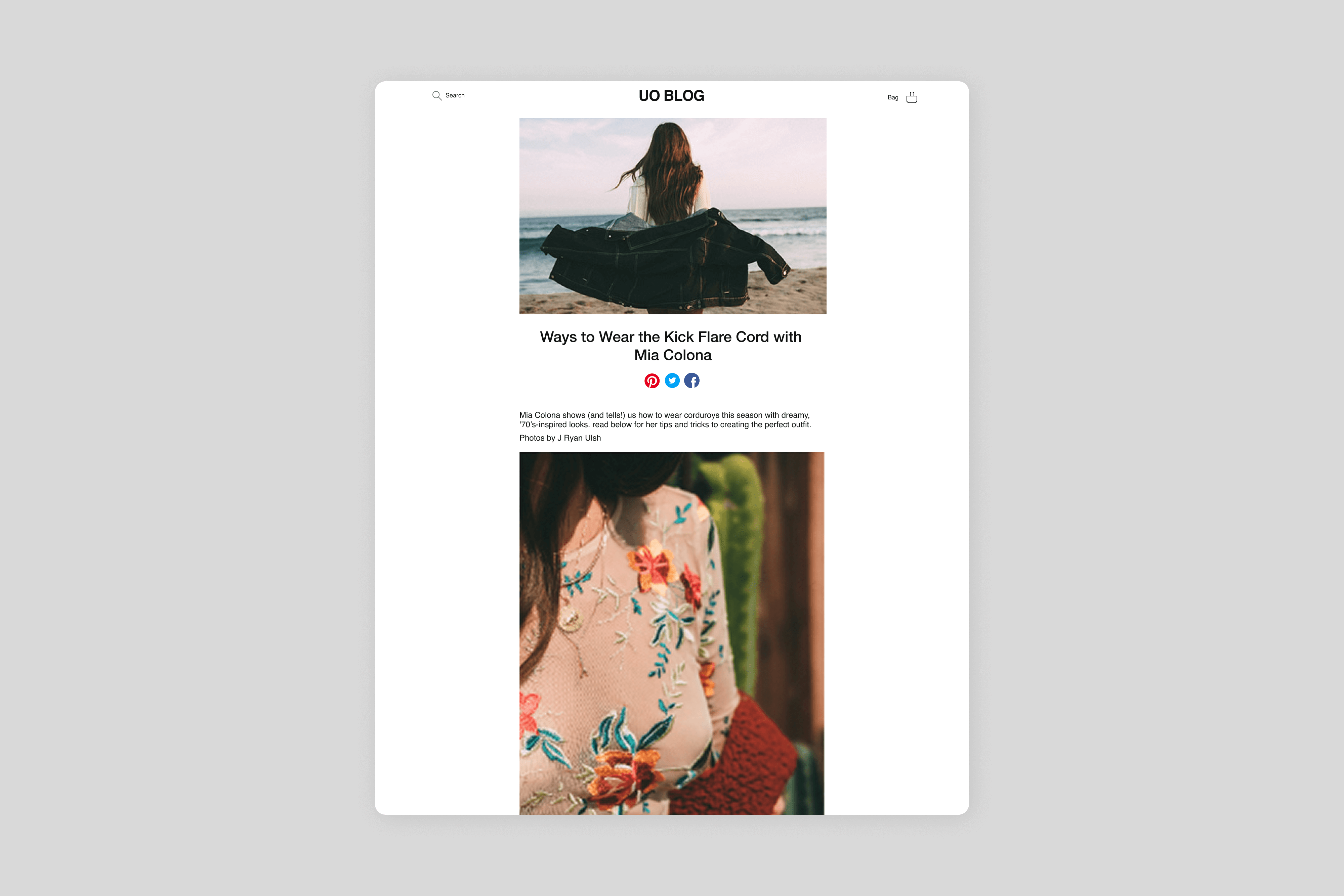
I overhauled the Urban Outfitters blog to create a more engaging experience. I introduced clear typographic hierarchy, integrated video content, quiz layout ideas and shoppable product rails.